The Sony building stands at the corner of Madison Avenue and 56th Street in midtown Manhattan. At 197m, it's a little higher than its immediate neighbours, but there are at least 60 taller buildings in the city. It is an inoffensive, creamy colour. At ground level there's a spectacular atrium. Yet when it was completed in 1984, it was considered the most shocking building in the world.
- Postmodernism: Style and Subversion 1970-1990
- Victoria and Albert Museum,
- London
- SW7
- Starts 24 September
- Until 15 January 2012
The reason is the top. You have to walk a block or so away to get a sense of it. The building, originally known after its first corporate owner, AT&T, is crowned by a broken pediment;
a circular space has been carved out of the apex of the triangle which tops the façade. It's a simple, rather beautiful gesture. It is also a huge act of betrayal by the architect and the most visible trace on the New York skyline of postmodernism, a cultural current that is the subject of
Postmodernism: Style and Subversion 1970-1990, a major new exhibition at the
V&A.
Why betrayal? The architect was Philip Johnson, who in 1932 had curated an extraordinary architectural show at the Museum of Modern Art. Images and models of buildings by Mies Van Der Rohe, Le Corbusier, Richard Neutra and others led a generation of architects to make an absolute break with the styles of the past and embrace the tenets of modernism, chief among which was the idea that form should follow function. Johnson termed this new wave the "international style", a name which stuck as the skylines of major cities (notably Chicago) were transformed by constructions of plate glass and structural steel, buildings which banished decoration, mere skin and bones enclosing volumes of space.
Initially a radically utopian architecture, dreaming of a rational future uncluttered by superstition and ornament, the international style had, by the 1970s, become a rather joyless orthodoxy. For every triumph of the movement, such as Mies and Johnson's
Seagram building or Le Corbusier's
Villa Savoye, there were 10 undistinguished tower blocks, whose indifference to their context seemed less an expression of universality than of the arrogance of planners. Britain suffered particularly badly, as shoddy system-built high-rises gave modernism a bad name from which it has never entirely recovered.
For the man who had brought the international style to North America to put an ornamental pediment on his building was like Mondrian deciding to put a vase of flowers in a corner of his black and white grid. The AT&T tower became known, sneeringly, as the Chippendale building, because it reminded observers of the ornamental broken pediments the 18th-century cabinetmaker often put on highboys and bookcases. A building that looked like a piece of furniture? It seemed trivialising, a tasteless joke.
But Johnson was not the only person finding his sense of humour. Suddenly serious architects were adding colour to their creations, making little historical references, nudges and winks. All sorts of things that had been off-limits came back: trompe l'oeil, vernacular, pastiche. Robert Venturi and Denise Scott Brown published a theoretical book about the tackiest built environment in the world, the Las Vegas strip. They called it, provocatively,
Learning from Las Vegas. The strip, they argued, with its riot of billboards and neon, was (literally) a place of signs rather than things, where the buildings were only a minor part of an environment of semiotic seductions, designed to be legible to a person travelling by at 35mph.
This is the essence of postmodernism: the idea that there is no essence, that we're moving through a world of signs and wonders, where everything has been done before and is just lying around as cultural wreckage, waiting to be reused, combined in new and unusual ways. Nothing is direct, nothing is new. Everything is already mediated. The real, whatever that might be, is unavailable. It's an exhilarating world, but uncanny too. You look around at your beautiful house and your beautiful wife and you ask yourself, like the narrator of the Talking Heads song: 'Well, how did I get here?" After that, it's only a short step to deciding that this is not your beautiful house and your beautiful wife at all. The world of signs is fast, liquid, delirious, disposable. Clever people approach it with scepticism. Sincerity is out. Irony is in. And style. If modernism was about substance, about serious design solving serious problems, postmodernism was all manner and swagger and stance.
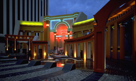
The curators of the V&A show have sensibly decided to steer away from art and literature (which could fill a second exhibition), and to present postmodernism as a set of design strategies, visible across the spectrum from fashion to graphics to furniture. They have also cheekily periodised it, choosing a 20-year time frame, which they gleefully ignore when it suits them. The result is revelatory, a ground-breaking history of a recent cultural past that has, almost without us noticing, gone from the cutting edge to the museum.
For designers, postmodernism meant making material things that felt like signs of themselves. The Italian pranksters of the Memphis group defined the aesthetic of the late 70s and early 80s with household objects that looked as if they'd materialised from cartoons, absurdly juxtaposed simple forms presented in bright, artificial colours. LA-based Peter Shire created candy-coloured furniture that always seemed on the verge of retreating back into two-dimensionality. His Bel Air chair of 1982 is the very avatar of postmodern weightlessness, an object that could exist at any scale, at home by a pool, in an aquarium, at the bottom of a cocktail glass. But postmodernism, protean, ever hard to pin down, wasn't just about a cartoon future. The taste for historical pastiche, for country kitchens and neo-Georgian kitsch, was also part of the same tendency. Laura Ashley, Merchant Ivory and the fake past of
Poundbury are (whether Prince Charles knows it or not) just as postmodern, in their way, as the fashion designs of Rei Kawakubo or the graphic riot of Arata Isozaki's Team Disney building.
If postmodernism could be fun and bright, it was also disturbing. In a friction-free world of signs, what happened to value? Nowhere did this question arise more forcefully than in Oliviero Toscani's advertising campaigns for Benetton, in which deliberately-confrontational images of Aids patients and death row inmates were used to sell pastel-coloured knitwear. The cynicism of Toscani's work seemed to suggest we were now living in the corporate world of
Videodrome,
David Cronenberg's 1983 horror film about a sleazy producer discovering an anonymous cable channel broadcasting extreme sexual violence. The relentless march of money across the cultural landscape of the 1980s, with figures such as
Jean-Michel Basquiat and Keith Haring describing brief and tragic arcs, seemed to many a fundamental debasement of the idea of art. To others, it was just fun.
Fittingly, for a cultural moment where everyone appeared to be playing themselves, postmodern performers such as Grace Jones, Leigh Bowery and Klaus Nomi developed a style of self-presentation that, for the first time, floated free of human limitations. On MTV (on air 1981) and magazine pages designed with the new Apple Macs (on sale 1984) they appeared both more and less than human, like the replicants from Ridley Scott's 1982 film
Blade Runner. Postmodern bodies often suggested machinery, as in the deadpan totalitarianism of the bands Kraftwerk and Devo. The most human of acts, such as singing and dancing, became infected with something robotic and unheimlich: David Byrne's jerky dancing and oversized organisation-man suits, Laurie Anderson's vocoder voice singing lullabies about Superman and big science, Boy George's liquidation of gender, Madonna's hyper-disciplined blonde bombshell, who seemed closer to the man-machines played by Arnold Schwarzenegger than the pop pin-ups of the previous generation. Jean-Paul Goude's manipulated, post-produced photos of Grace Jones, her limbs elongated, her oiled skin suggesting chrome and spray paint, stand among the most powerful documents of the period. Jones was pointing the way towards something both troubling and exhilarating, something which as the 80s became the 90s, became codifed as the "posthuman".
Glenn Adamson and Jane Pavitt, the curators of the V&A show, point to the video for New Order's "Bizarre Love Triangle" as a paradigm of postmodern visual style. Its director, the New York artist Robert Longo, produced a palimpsest of decontextualised, pixellated imagery, incorporating a signature of his
Men in the Cities series of images of contorted, falling figures dressed in business wear. Post 9/11 this is uncomfortable to watch, which makes it even more curious that
Mad Men, the popular TV drama, alludes to Longo's figures in its title sequence, which has a businessman falling past a façade that inescapably calls to mind the most famously absent international style buildings in Manhattan, the twin towers of Minoru Yamasaki's World Trade Center.
For many, the events of 11 September signalled the death of postmodernism as an intellectual current. That morning it became clear that "hostility to grand narratives", as Jean-François Lyotard defined it, was a minority pursuit, an intellectual Rubik's cube for a tiny western metropolitan elite. It seemed most of the world still had some use for God, truth and the law, terms which they were using without inverted commas. Graydon Carter, the editor of Vanity Fair, was widely ridiculed for declaring that the attacks signalled "the end of the age of irony", but his use of the po-mo buzzword proved prescient. If irony didn't vanish (though during the crushing literalism and faux-sincerity of the Bush-Blair war years it seemed like a rare and valuable commodity), postmodernism itself suddenly seemed tired and shopworn.
Use Google's
ngram viewer to look at the incidence of the word "postmodernism" in books since 1975 and you find a sharp rise, peaking in around 1997, then an equally sharp decline. Plot this against the use of the word "internet" and the comparison is startling. Almost unused before the mid-80s, "internet" overtakes "postmodernism" in 2000, and carries on rising. All avant-gardes are in the business of futurism. They make an attempt to inhabit the space they predict, and in so doing, they bring it into being. Postmodernism was, crucially, a pre-digital phenomenon. In retrospect, all the things that seemed so exciting to its adherents – the giddy excess of information, the flattening of old hierarchies, the blending of signs with the body – have been made real by the internet. It's as if the culture was dreaming of the net, and when it arrived, we no longer had any need for those dreams, or rather, they became mundane, part of our everyday life. We have lived through the end of postmodernism and the dawning of postmodernity.